The Babyliss Big Bet

The Babyliss Big Bet

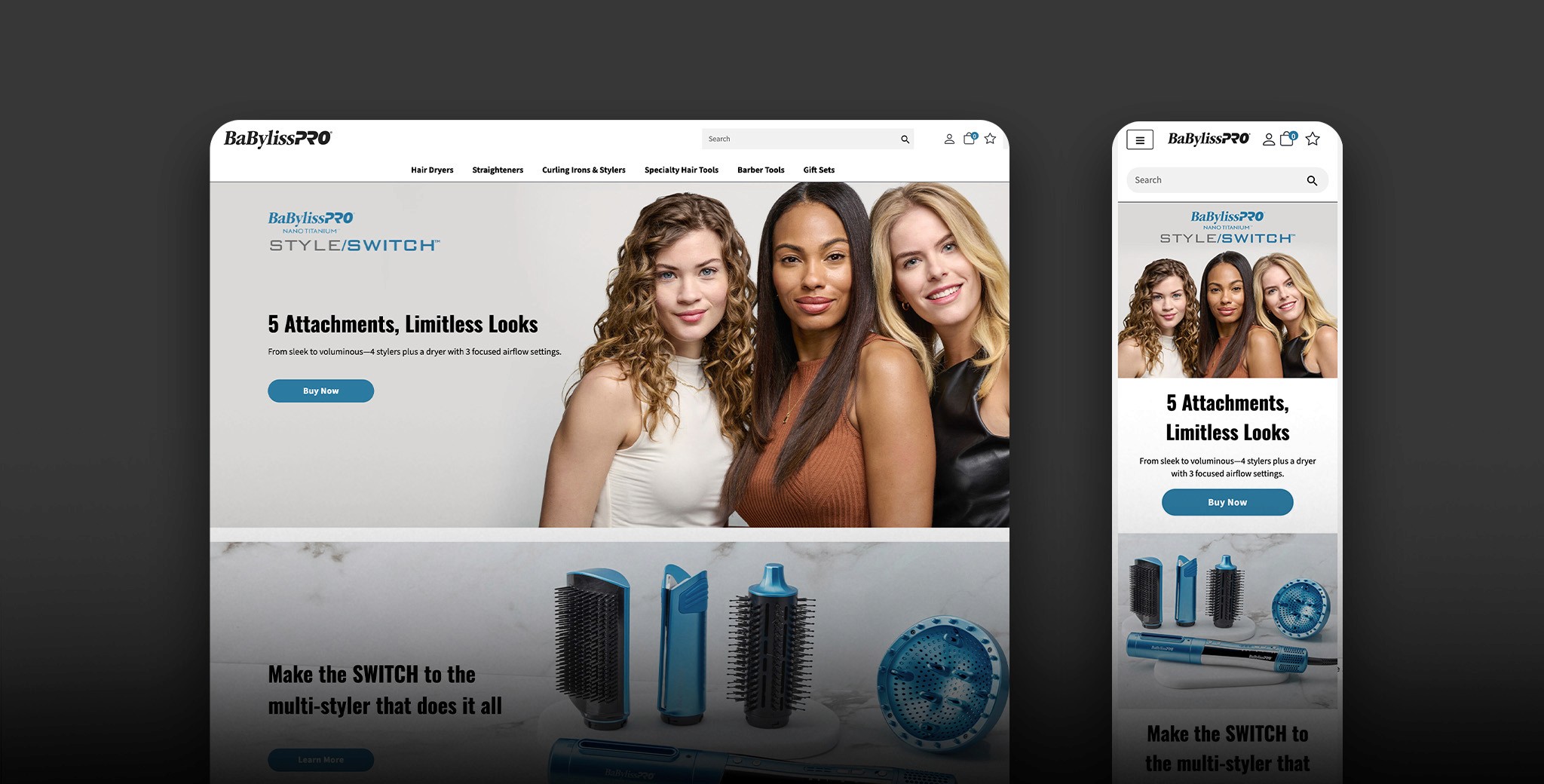
Think of a landing page like giving your product its own stage to shine. Instead of throwing it into a crowded store where it has to compete for attention with everything else on the shelf, a landing page says "hey, look at this one thing" and nothing else gets in the way.

Client

BaByliss Pro

Role

Design, UI.UX

The Mission

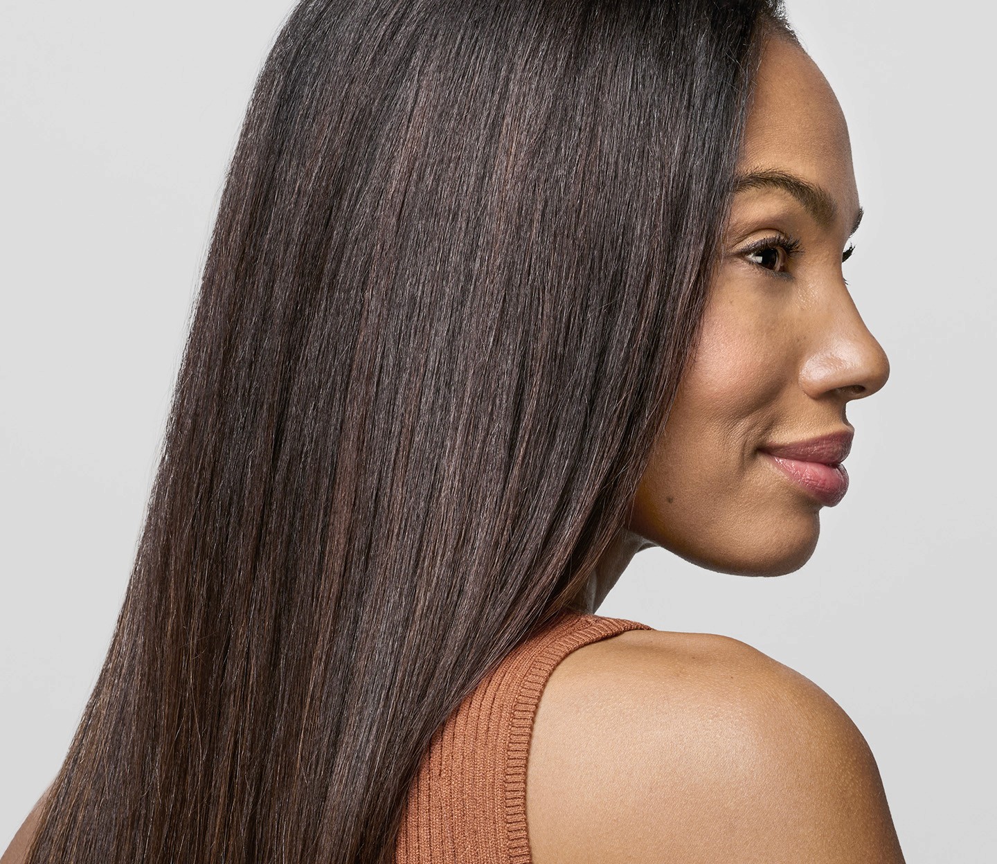
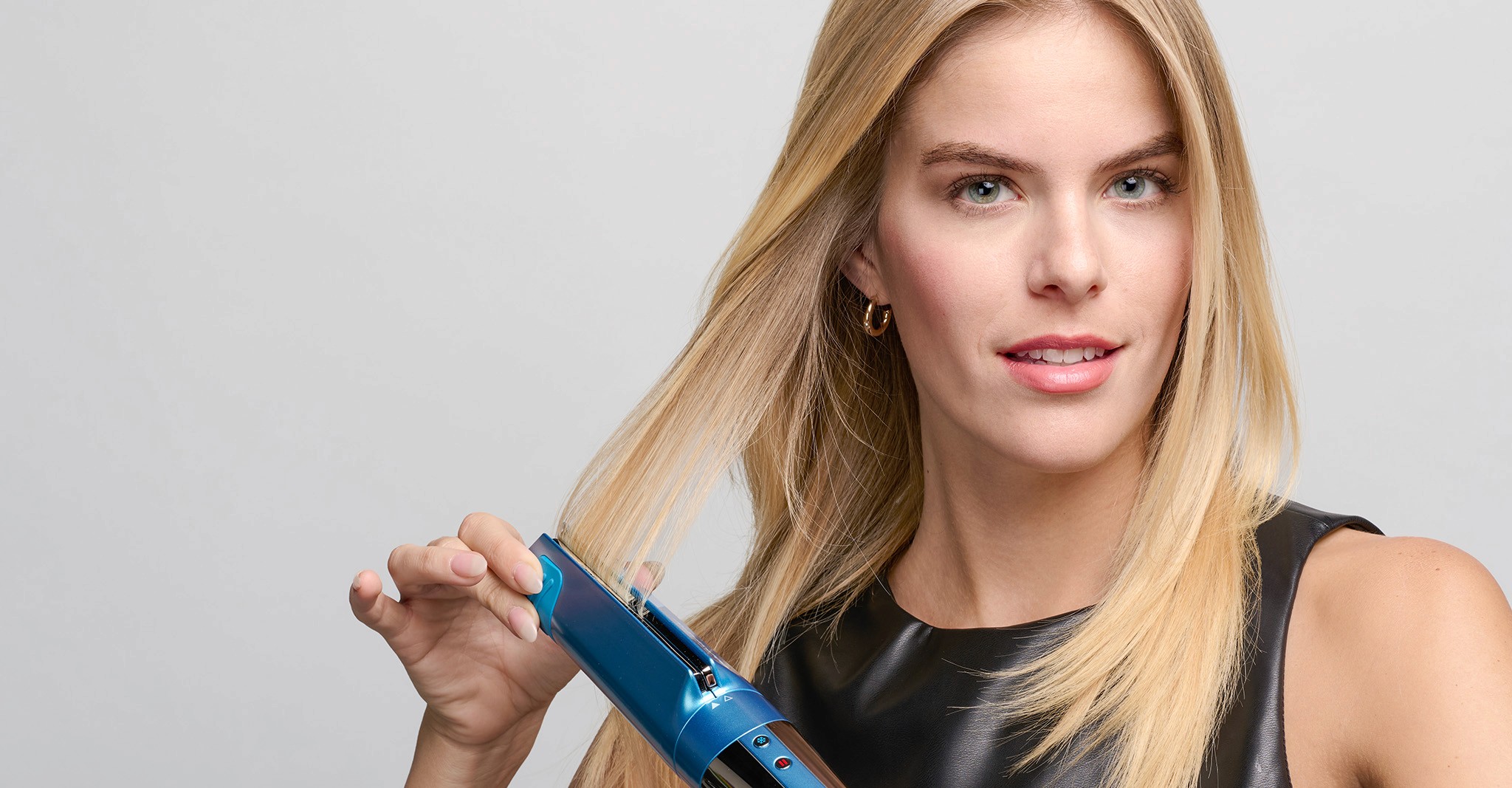
BaBylissPRO was dropping something big. The Style/Switch™, a game-changing all-in-one tool that lets you curl, style, and dry your hair without swapping between a bunch of different products. One unit, endless looks. Pretty revolutionary for the hair tool space.

The problem? As hot as the product was, it didn't have a dedicated landing page to really tell its story and get people excited. For a launch this big, consumers need a place to land, learn, and get excited. A strong landing page would've been the perfect home base to build brand awareness, and convert all that buzz into actual buyers.

The primary purpose of creating a dedicated landing page for the BaByliss Pro Style Switch was to maximize the commercial potential of a product identified as a likely top seller within the BaByliss Pro lineup.

Let's

Connect

Get in touch with me and let's create something amazing and explore what we can build together!

Let's

Connect

Get in touch with me and let's create something amazing and explore what we can build together!

Let's

Connect

Get in touch with me and let's create something amazing and explore what we can build together!